thegrey.berlin
Brand Identity & Website for a Berlin Rug Label
A brand that starts as open as the label itself.
thegrey.berlin is an own side label — a Berlin-based manufactory concept for fully custom, handcrafted rugs made from pure New Zealand wool. No catalogues, no standard sizes, no templates. Just: your idea, our craft.
The brief: build a brand and digital presence from scratch that carries exactly that. No template. No generic agency aesthetic. Instead, an invitation — as open as the label itself.
01 — Brand & Tone of Voice
The guiding line emerged early: „Regeln aus. Teppich an.” — Rules out. Rug on. Short, direct, memorable. An anti-rules rhetoric that doesn’t sound loud, but confident. Berlin attitude as a design principle — edgy, restless, never fixed in one direction.
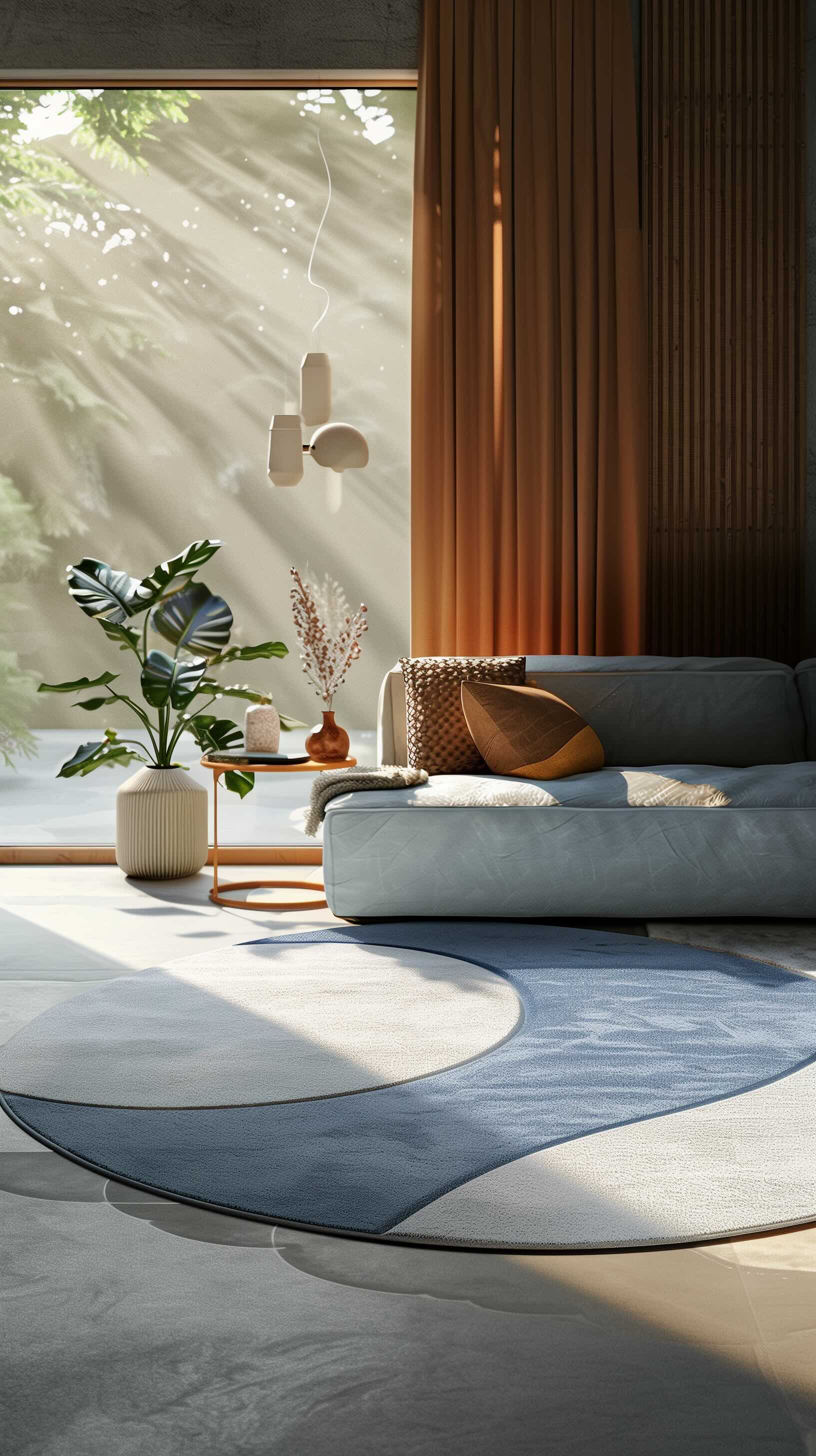
The GREY wordmark logo with its deformed letterforms is the visual core of the brand — unmistakable, without feeling playful. Designed by Aleksandar Živković, a Ruhr-based designer specialising in visual identities and typography, and lecturer for type and typography at FH Dortmund. Typography in Archivo: clear, technical, with character. The Berlin black-and-white photo in the hero sets the geographic and emotional anchor.
02 — Feature Architecture
Four core statements — All Designs, 1300+ Colours, Flexible Shapes, 100% Handcrafted — sit as a quiet column strip above the approach section. No icons, no infographics. Just numbers and words that speak for themselves.
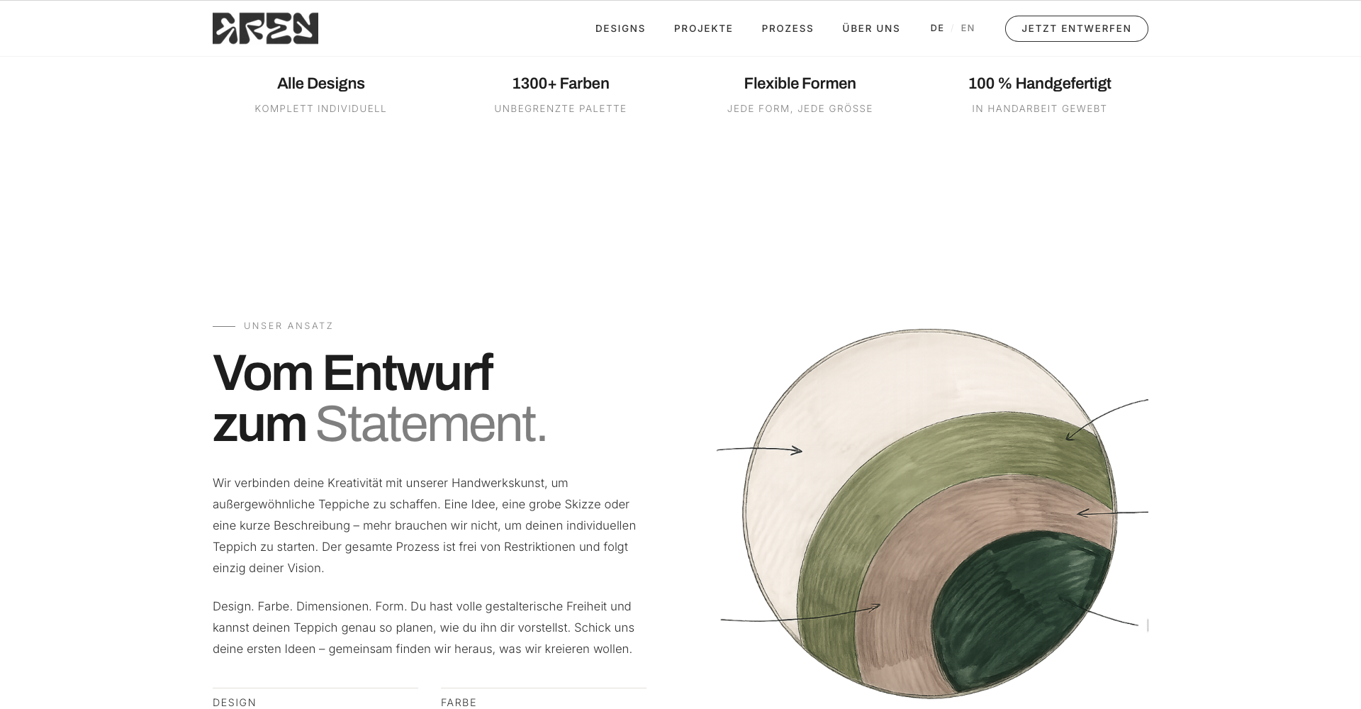
The hand-drawn rug sketch on the right — Pantone colour palette, organic shapes, dimensions — makes the process immediately visible: this is craft, not a configurator.
03 — Projects & Gallery
The gallery grid shows selected rugs, dream commissions, and design inspirations. Three categories: All, Project Inspirations, Wanna Does. Filters set discreetly — those who don’t need them simply scroll on.
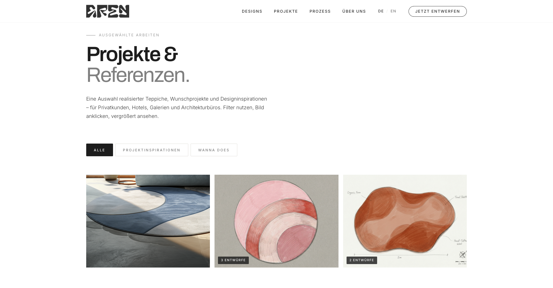
Each image can be expanded via lightbox. For design series, a badge shows the number of variants — “3 Designs”, “2 Designs” — without overloading the grid.
04 — Process as Dark Contrast
The process block reverses the page’s brightness ratio: black background, white type, clear structure. Three steps — 01 Idea, 02 Craft, 03 Story — no overhead, no form-filling maze.
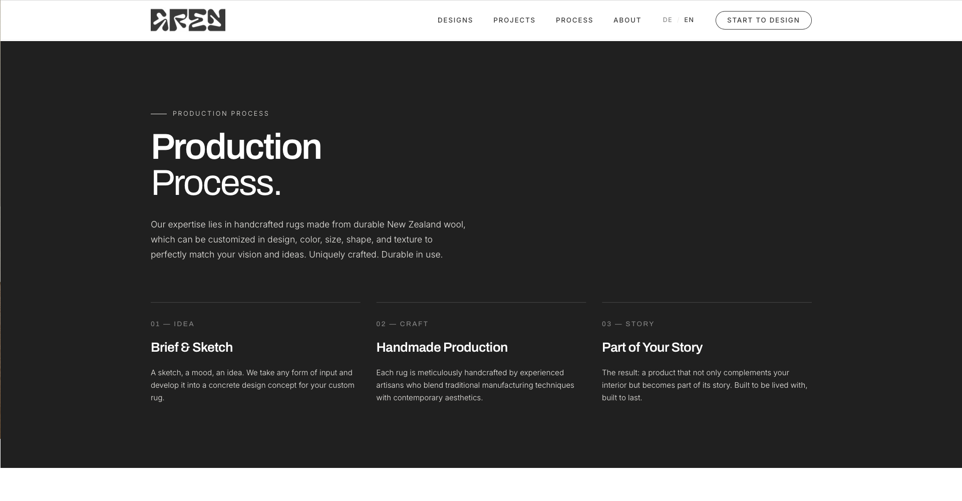
The principle: a brief and sketch are enough to get started. Everything else emerges through dialogue. Just like the label itself works — open at the beginning, conceptual at the end.
05 — Mobile First
The site isn’t “also suitable for mobile” — it was built mobile-first and then scaled up to desktop. Burger navigation, responsive grid, lightbox on small screens too.
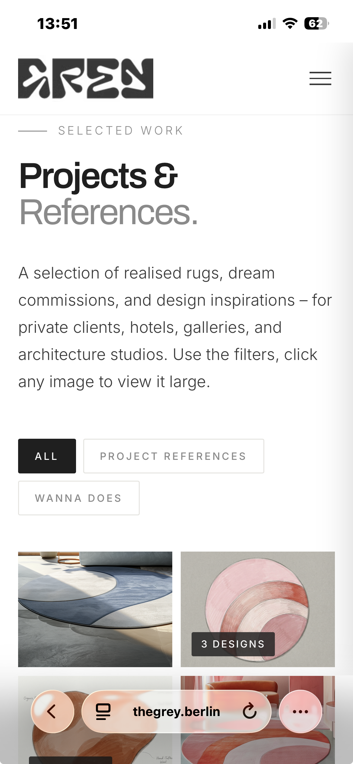
The typographic hierarchy and gallery logic hold on every device — not a simplified mobile variant, but the same language in a compressed format.
06 — Speed Through Reduction
The site runs on pure HTML/CSS/JS — no build pipeline, no framework, no tracking libraries. Hosted on Cloudflare Pages, global CDN, automatic deployment from GitHub. Bilingual (DE/EN) with hreflang structure and canonical tags on all main pages.
This reflects the studio principle: modern tools in the background, quiet result in the foreground.
Outcome
Complete brand identity and website from scratch — concept, design and code in one. Bilingual presence with gallery grid, lightbox, category filter, and three-step process flow. Hosted on Cloudflare Pages, Lighthouse score above 90 across all categories.