Ji-Na Kim
Editorial brand site for a makeup artist
A stage that doesn’t get in the way of the work.
Ji-Na Kim is a makeup artist based in Berlin — credits include Gute Zeiten, schlechte Zeiten, Cloud Atlas and Die Päpstin. Her work is precise, calm, camera-ready. Her website needed to feel the same way.
The brief: a digital presence that doesn’t compete with her images, but gives them the room they deserve. Bilingual, for international productions. Fast enough that casting directors and photographers don’t wait on load times. And, above all: not template-shaped.
01 — Approach
Editorial, not portfolio-showcase. The site reads like a short magazine feature: hero, introduction, work as a curated grid, services, contact. Section numbering as a quiet editorial accent. Type in a thin grotesk, generous whitespace, no decorative noise.
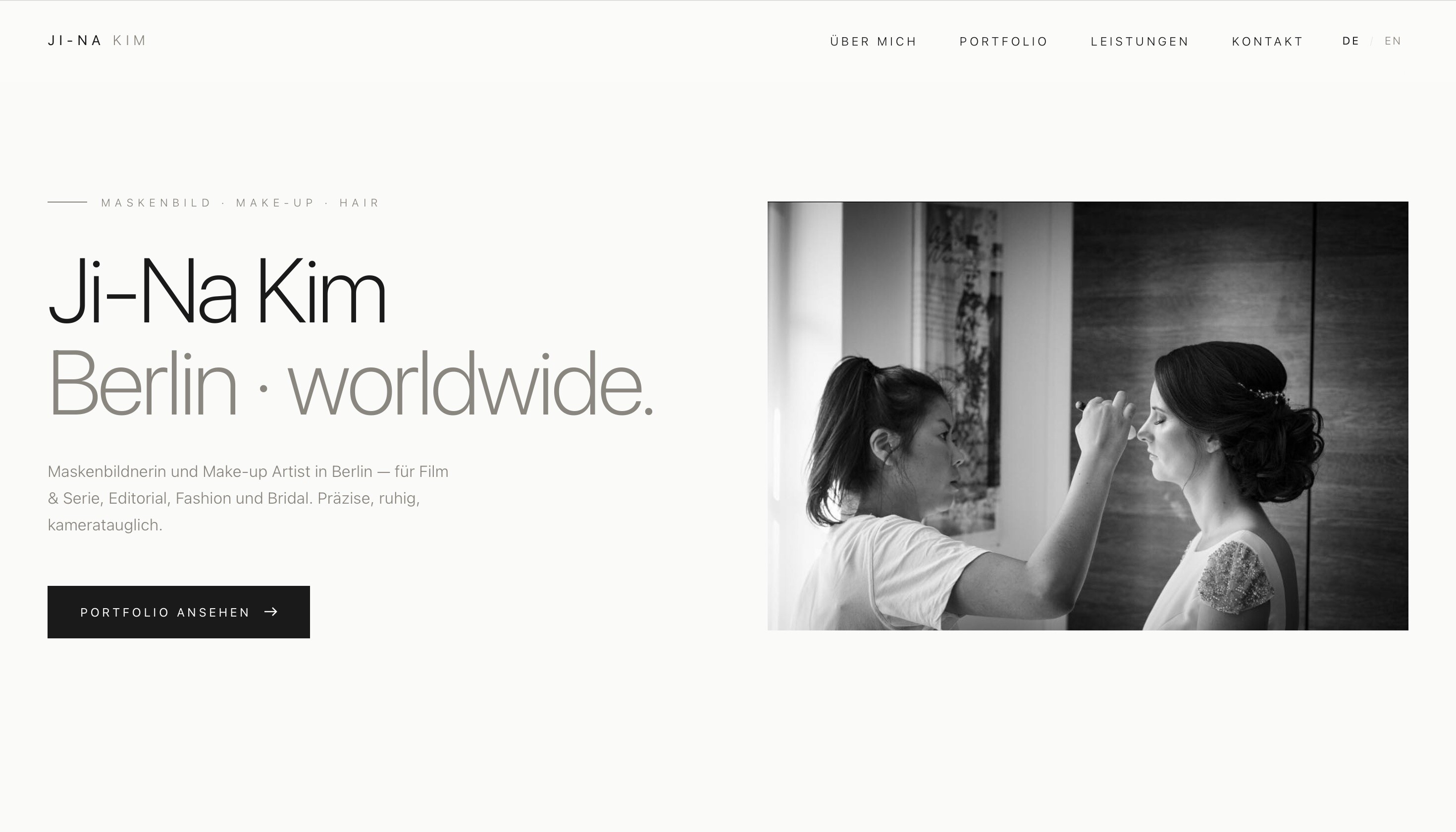
The hero shows Ji-Na as a portrait — not a mood image, not an abstract composition. The headline “Ji-Na Kim · Berlin · worldwide.” sits in two weights — the black-and-white logic of the brand continues into the typography.
02 — Editorial hierarchy
Each section carries a number and a short title, aligned left or right. This gives the scroll a rhythm and turns a long page into a sequence of clear chapters.
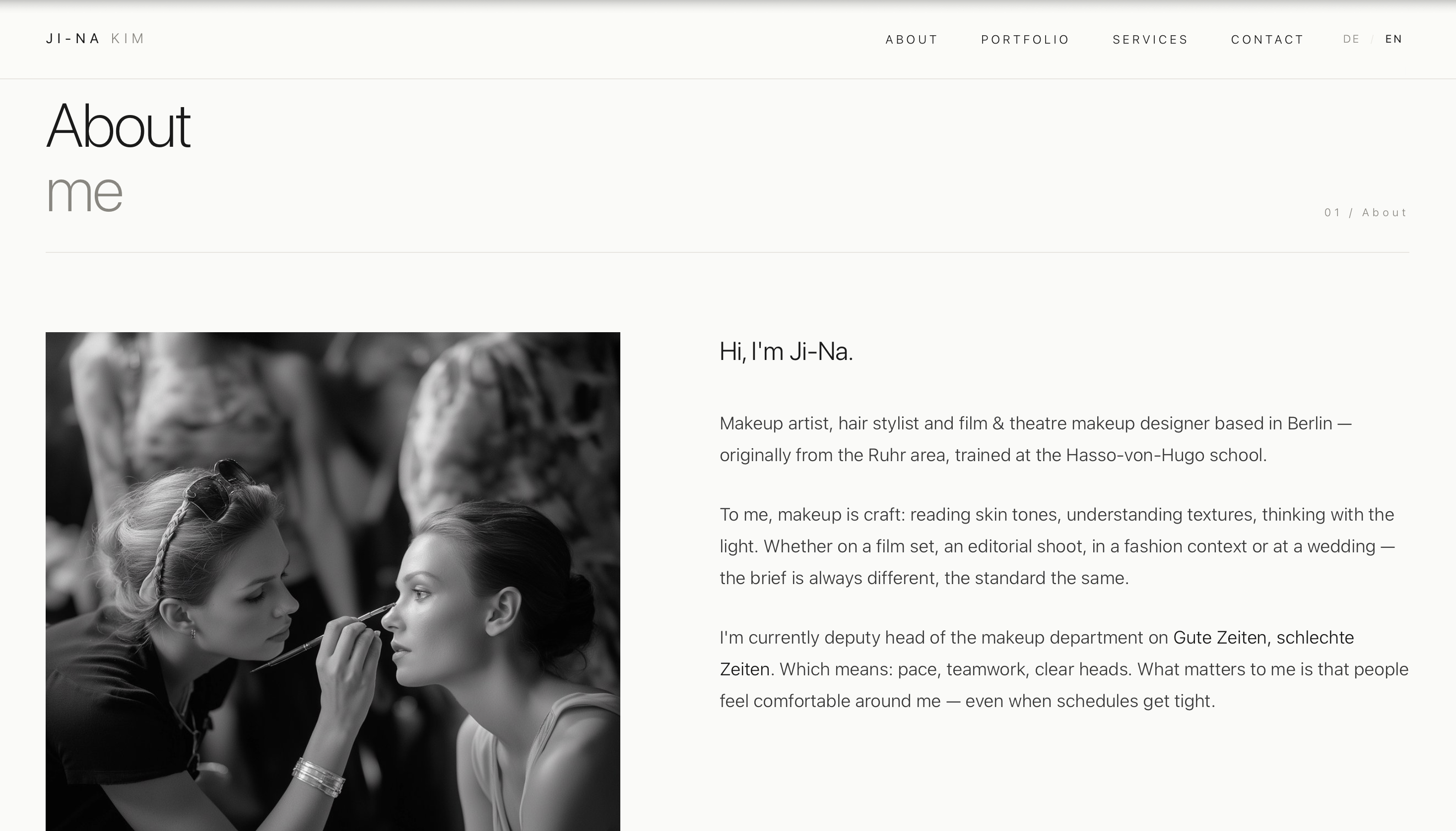
The about section mixes a personal tone with professional credits. Selected productions sit as a quiet list at the end — no logos, no buttons, only text. Premium comes from restraint.
03 — Portfolio as an editorial grid
The portfolio is the heart of the site. An asymmetric grid instead of a conventional image gallery, with filters for the four working areas (Editorial, Beauty, Film & TV, Bridal). The filters are placed discreetly as small buttons — anyone who doesn’t need them simply scrolls on.
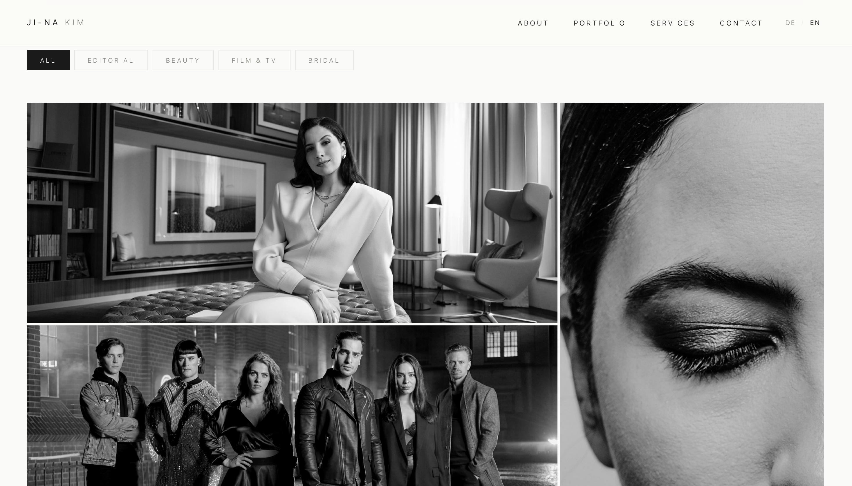
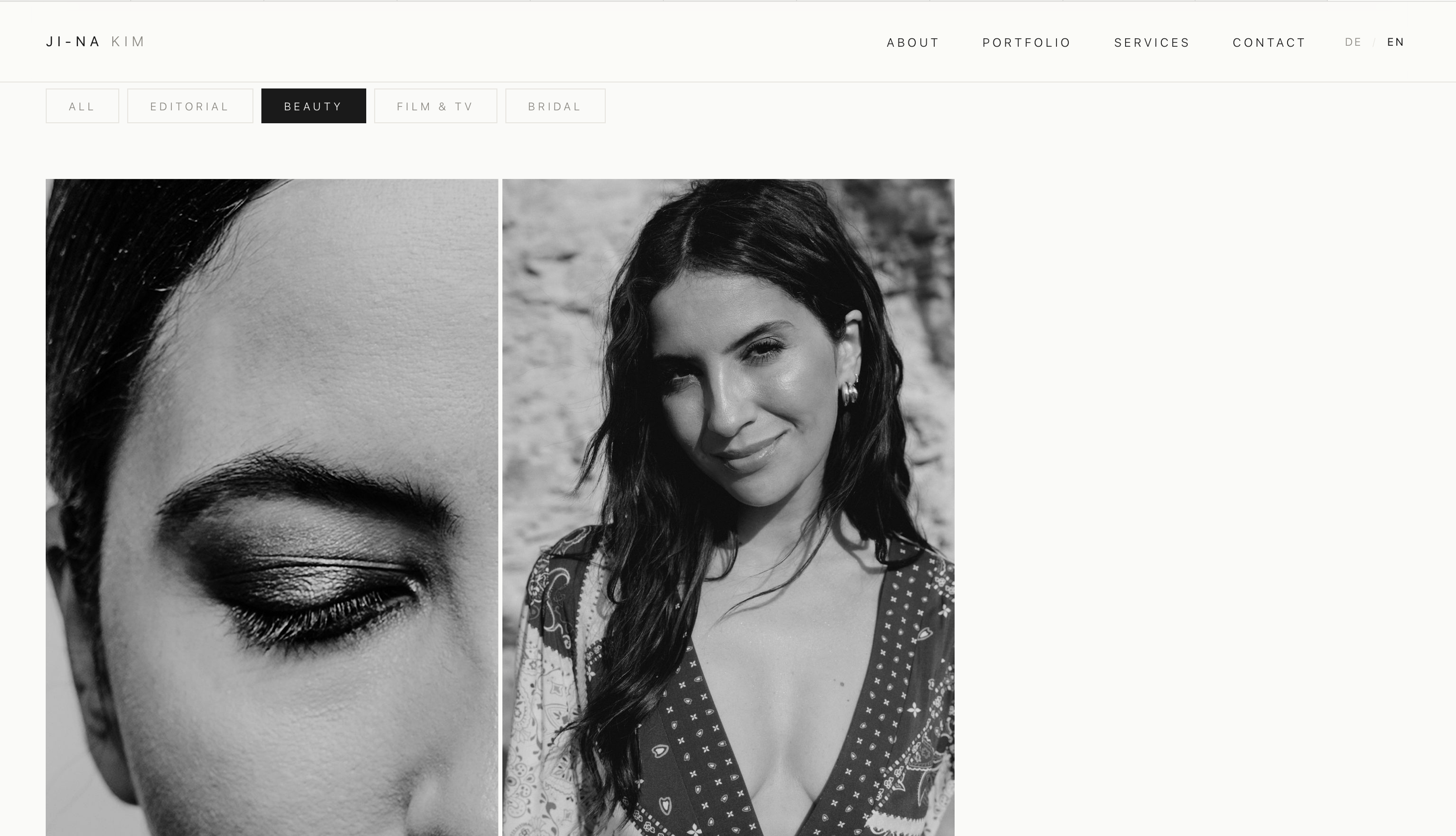
A key detail: the grid keeps its editorial composition across every filter group. No gaps, no abrupt jumps — the software sorts intelligently and preserves the sense of rhythm.
04 — Services as an editorial list
Five services — Film & Series, Editorial & Fashion, Bridal & Weddings, Event & Red Carpet, Hair Styling. Instead of classic service cards with icons, we chose a calm, numbered list. Roman numerals as a typographic accent.
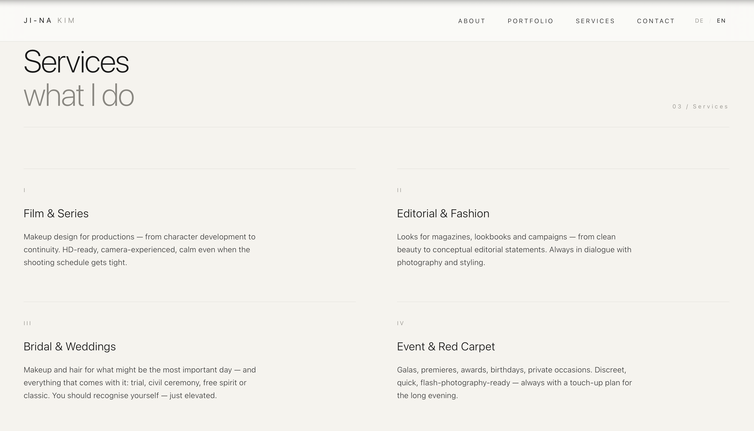
The bilingual logic — German and English via a toggle in the top right — switches the entire page, not just the main headlines. All the way through to service descriptions and pull-quote.
05 — Contact as a statement
“Let’s work together.” — the contact block inverts the page’s brightness relationship.
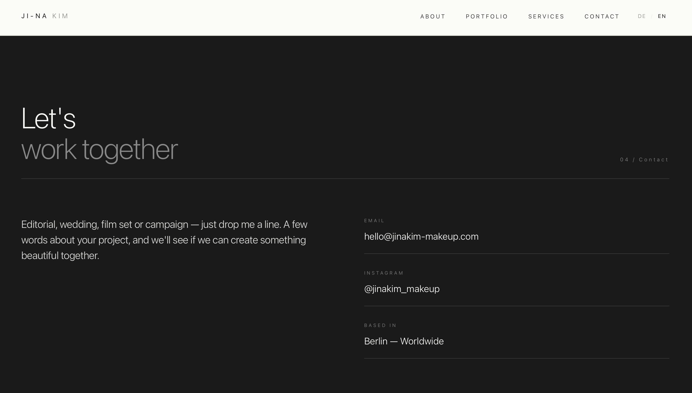
Black background, a large typographic gesture, clear contact details. No form to substitute for the intimacy of a real email thread — Ji-Na’s clients write emails, they don’t fill out forms.
06 — Mobile, from the start
The site isn’t “also suitable for mobile” — it was designed for mobile and then scaled up for desktop. Casting directors read emails on their phones, bookings happen on the move.
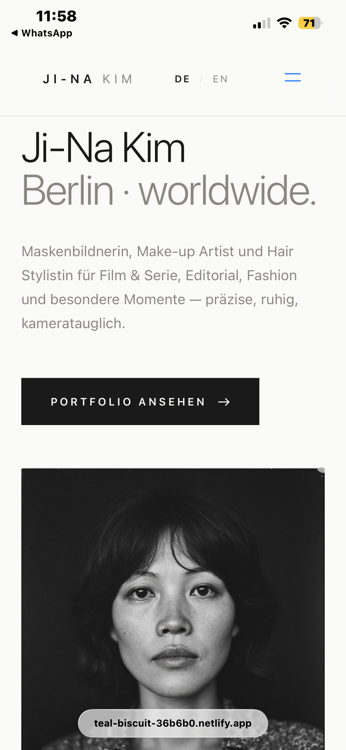
The mobile view keeps the typographic hierarchy and the editorial feel — not a simplified mobile variant, but the same language in a more compact format.
07 — Pace through reduction
The site runs on a single HTML file with embedded CSS and minimal JavaScript. No framework, no build step, no tracking libraries. Hosted on Netlify, served free of charge through the global CDN. Result: Lighthouse score above 95 across all categories, time-to-interactive under one second.
That mirrors our studio principle: modern tools in the background, quiet results in front.
Outcome
Four days from brief to launch. A bilingual editorial site with ten curated portfolio pieces, four filter categories, five service descriptions. First booking inquiry through the new site within the first 48 hours online.